Why yes, I do name my watercolour palettes! And yes, my travel palettes are named after space shuttles. In the next couple of palette tour posts I’ll give you a peak into my travel palettes.
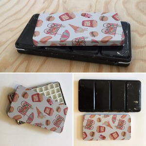
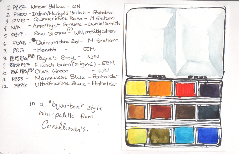
Discovery Travel Palette: A Bijou box from filled with an assortment of “extra” paints
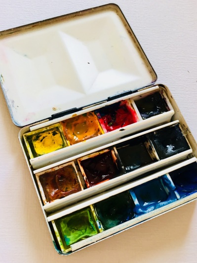
The first travel palette I’d like to introduce you to is Discovery. My Discovery palette is a small, bijou-style box from Cornellison’s.
I’ve mentioned this palette box in my gift guide post a couple months ago. I love this little palette because it is very small, yet can hold 12 half pans from any brand.
The “from any brand” feature is important. Previously I was using the ubiquitous plastic Cotman watercolour palette, which is functional, but can only hold Winsor Newton half pans, which are slightly smaller and have a different shape than others. As a result I couldn’t fit many of the pans I had from other brands.
This little palette box will fit and securely hold any brand of half pans, which are held in place using v-shaped metal inserts which anchor the pans in place.
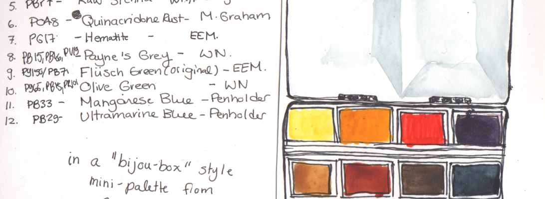
Watercolour sketch of my Discovery Palette with current paint list
I have filled my Discovery palette with an assortment of “extra” paints that don’t have a home in my larger studio palettes (in all different kinds of half pans).
Some of the paints in this palette are unique paints I bought from handmade paintmakers just for fun. Some are are beautiful paints that don’t have great lightfastness ratings so I prefer not to use them in my finished paintings, but are great for sketches. Some are pigments that I have multiple versions/pans of from different brands. A few of these paints are relics from a Winsor Newton palette I bought years ago – pigments and mixes I never reached for and removed from my studio palette.
I won’t post links to the specific paints as this collection is expected to change frequently, and I do not have a particular attachment to many of these paints.
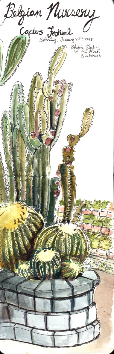
Urban Sketch of Belgian Nursery Cactus Festival – Created using only paints from my Discovery Palette.
Whereas in the studio I am often very focused on creating precise colour mixes, and depend heavily on extensive glazing of transparent pigments, I use my travel palettes as a way to explore and play with pigments and mixes that aren’t what I would usually reach for, and to quickly add colour to urban sketches and field studies.
In a sketchbook context, I love watching granulation and bleed effects happen on the page, and I work in fewer, less precise layers to quickly capture larger scenes.
As a result, many paints which frustrate me in the studio actually work great in a travel palette. I find limited uses for heavily granulating Manganese Blue and Hematite, or sparkly amethyst in a studio context. However, when I am sketching and less concerned with achieving a specific controlled look, I am delighted by green leaves and purple flowers with textured teal spots on them, or shadows that sparkle.
Using a constantly changing selection of paints, each with unique and surprising behaviours, also stretches me out of my comfort zone and helps me to grow as an artist.
The sketch on the left was created during an urban sketchers outing, using only colours included in my Discovery palette. Without my comfortable favourite pigments to work with, I had to experiment to create varied and interesting greens using the materials at hand.
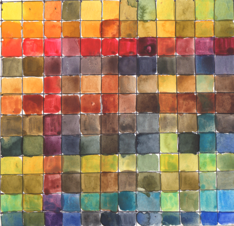
Of course, I can’t resist painting out colour charts and swatches whenever the opportunity arises. The painted colour chart below containes the mixes of the 12 colours currently in my discovery palette. I’m almost out of a couple of them, so a new chart will be needed soon!
Most of the watercolours in my collection are from established brands such as Schmincke and Sennelier. However, there is another option for purchasing watercolour paints. Independent watercolour makers are a growing industry.
Buying watercolours from handmade paint makers is one way to try out unusual pigments. Indie paint makers buy powdered pigments from sources such as Kremer Pigments, or collect their own natural pigments. Handmade brands sometimes offer pigments that are not available in larger brands.
Buying from an indie paint maker is kind of like buying usable art. The personality of each paintmaker shows through their packaging, colour selection, marketing, etc. Many handmade brands also have curated paint collections with a consistent “look” or personality to their paints.
Handmade watercolour paints are not a budget option – the high manual labour cost of making watercolour in small batches means that indie paint brands tend to be more expensive than commercial brands. (Some) indie paint brands can also be frustrating, as indie paint makers may use creative names for common pigments, advertise fugitive paints as lightfast, and do not publish pigment information.
My favourite handmade watercolour brands
Here are a few handmade watercolour brands I love. I have had amazing experiences with these brands:
Pruche paints have clear and concise pigment documentation in the listings, on the packaging, and directly on the pans, which I strongly appreciate. Pruche paints have a pleasant, even consistency, strong pigment load, rewet readily and are neatly poured into, in her words, “the nice pans from Jackson’s” (Eve and I agree on this point, the half-pans at Jackson’s are much nicer than many other half-pans on the market).
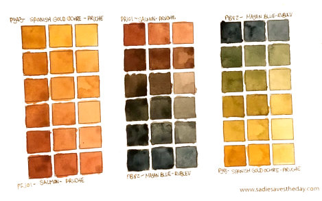
Muted mixing chart featuring two earth colours from Pruche (Salmon and Spanish Gold Ochre)
Pruche paints are an ideal choice if you are looking to supplement or replace a basic collection of commercially made paints. Her use of primarily single pigments and great pigment documentation make it easy to shop for both well-known pigments and unusual extras.
I have used Pruche paints (in Spanish Gold Ochre, Prussian Blue, and Salmon) as the inspiration for a limited gamut travel palette I recently built, and will tour in my next blog post. Like many brands, Eve posts her shop updates on Instagram
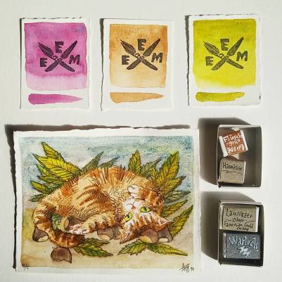
These are mad scientist paints. I strongly, strongly recommend making friends with EEM’s creator, Amé, on Instagram. There, you’ll learn how she sources all kinds of rare and unusual pigments, and then mixes them up into moody, granulating, crazy, colourful, misbehaving magic paints that also happen to be vegan and smell like cloves.
Special Delivery from Eventually, Everything Mixes.
She makes paints out of ground up epidote and burnt green earth and the rare bluer shade of cobalt teal which she found in some hole in the wall shop in Berlin. If you buy Flüsch Green (a spring green made with the unique PB71 Zirconium Cerulean) she’ll ship you a multimedia painting of one of her cats.
My EEM paints are fun paints. They’re more of a wild ride to use than strictly practical (although I have found practical uses for them – the Flusch Green is actually perfect the bright springy undertones of many plants).
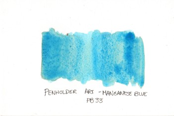
If you’re a pigment geek or history buff looking for the highest pigment load, or rare discontinued pigments, Penholder Art is the handmade paintmaker for you.
Penholder Art is, I believe, one of only 2 remaining small manufacturers of real unadulterated PB33 Manganese Blue paint, an absolutely beautiful electric blue pigment that has been discontinued from pigment production due to toxicity. Penholder Art also produces several other rare paints made with toxic/discontinued historic pigments.
Penholder Art is a relative newcomer to the paintmaking world, and slightly rough around the edges. Packaging can be slightly messy and some paints can be a little sticky/messy. However, Dan from Penholder Art is very friendly and approachable, and offers fantastic prices on some of the most saturated and vibrant paints I have ever seen.
The (relative) giant in the handmade watercolour world is Greenleaf and Blueberry. They have a massive social media cult following, which allows them to post flash sales which sell out within minutes.
Greenleaf and Blueberry Colour Test Page (Not Colour Balanced
In September 2017, I managed to catch one of these sales, and impulse bought myself a little earth secondary triad of three whole pans. They are nice paints, but after taxes and shipping and duty, cost me over $120 CAD, or over $40/pan (for earth colours!). I honestly can’t imagine any paint, no matter how revolutionary, being worth that much money, and these paints are just nice.
For comparison, I swatched out some similar colours from other handmade and commercial brands, which were all less than a third of the price. All these paints rewet and granulate similarly and are equally saturated.
Comparison of Greenleaf and Blueberry Paints with EEM, Pruche, Daniel Smith and Da Vinci Paints
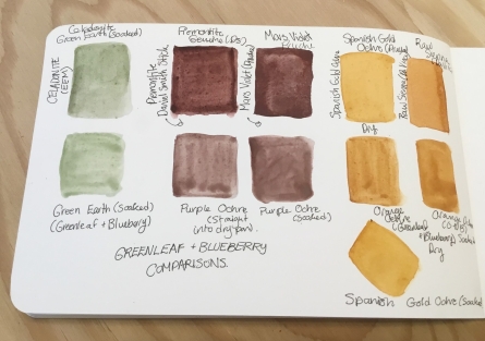
On the far left to right we have Celadonite Green Earth by Eventually, Everything Mixes, compared to Green Earth by G&B. I had trouble getting a saturated pigment load from either as I’ve done in the past, perhaps because of the super dry and cold weather. However, these two paints are nearly identical. The EEM paint is about 1/3 the price per volume.
In the middle, I compared Purple Ochre to Piemontite Genuine (Watercolour Stick) by Daniel Smith, and Mars Violet by Pruche, which are both very similar but slightly more reddish than the G&B paint. Both the Daniel Smith and Pruche paints rewet much more easily and are more saturated. The Pruche paint is around 1/3 the price per volume, and the Daniel Smith sticks are a great deal, at about 1/8th the price per volume.
On the right, I compared Orange Ochre to Spanish Gold Ochre by Pruche, as well as Raw Sienna by Da Vinci. The gold ochre is slightly more yellow, and the Raw Sienna is slightly browner, but they are all very similar and equal saturation (although both handmade paints required some coaxing to rewet in this dry weather). The Spanish Gold Ochre, again, works out to about 1/3 the price, whereas the Raw Sienna, always an affordable paint, I got on clearance sale for $5 for a 37 mL tube (which I think works out to about 1/16 the price or less).
I was hesitant to post this review, because Greenleaf and Blueberry is a cool company who make an effort to source unique pigments, and they really are good paints. If money is no object, Greenleaf and Blueberry paints are great.
However, I wanted to post an unbiased review to cut through some of the social media hype. If you’re on a budget, you can get very similar paints without spending nearly so much money, and even support smaller handmade paint makers in the process.
Do you have a great handmade watercolour brand to recommend? Let me know in the comments!
THIS POST CONTAINS AFFILIATE LINKS. LEE ANGOLD IS A PARTICIPANT IN THE AMAZON SERVICES LLC ASSOCIATES PROGRAM AND THE JACKSON’S ART AFFILIATE NETWORK. THESE ARE AFFILIATE ADVERTISING PROGRAMS DESIGNED TO PROVIDE A MEANS FOR SITES TO EARN ADVERTISING FEES BY LINKING TO PRODUCT LISTINGS.
This year I will turn over a new leaf (pun intended) with a year long project titled “The Daily Leaf”. Each day in 2018, I will collect a leaf outdoors and create a sketch, painting or illustration of each leaf I collect throughout the year.
Who
Hi, I’m Lee Angold. I’m an artist focused on botanical and scientific subjects, and this is a personal project I’ve set for myself.
I welcome others to join me. Feel free to join the ride for a week, a month or even just a single leaf. Tag your daily leaf paintings with #dailyleaf on Instagram and Twitter!
What/When?
Starting today (January 1st, 2018) and every day in 2018, I will collect a leaf outdoors, and create an illustration/sketch of that leaf. I will also record the location where each leaf was collected, and strive to identify the species of each leaf.
I will share my daily leaf illustrations on social media (Instagram, Twitter and Facebook) using the hashtag #dailyleaf, as well as through periodic updates to this website. The size, scale, style and media used in my illustrations may vary, and I may arrange multiple daily leaves into larger illustrations containing multiple leaves.
Where?
My leaves may be collected from wherever I happen to go. The only rule is I have to personally collect my daily leaf, outdoors, myself, each day. Unfortunately, these rules mean I cannot paint the cool leaves from the tree in your backyard, unless you invite me over to pick a leaf myself 😉
Realistically, I spend over 90% of my life within a 1km radius, mostly between my home and my studio, so you can expect that most of my leaves will be found in midtown Kitchener-Waterloo, Canada. As some of you reading this from similarly arctic climates may already have clued in, this also means that my leaf selection for several months will be …interesting (for select values of interesting where interesting mostly means dry, brown, decayed, and found in a snowbank). This is part of what makes this project so cool (Right? I hope? Somebody reassure me please!)
Why?
Why a daily challenge?
I am a strong believer in the power of daily habits, both in art and in life generally. I’ve been impressed with my progress during past daily challenges Inktober 2017 and September Watercolour Challenge 2016.
My daily art pieces are a reflection of my environment. My daily pieces are also particularly affected by other factors such as my mood, time constraints or just new materials and techniques I am eager to try out.
Why leaves?
Leaves are a very popular and very feared subject for artists. They are deceptively complex, and can be difficult to render right. They are also plentiful and diverse, and in a variable climate like here in Kitchener-Waterloo, the appearance of leaves offers a unique way to track the weather and seasons.
By painting a leaf every day, as well as documenting it’s location and species, I expect by the end of the year to have created a unique yearlong “journal” snapshot. This project will be a diary of the changing seasons and an insight into biodiversity focused in a small urban area. It will also serve as a record of my own development as an artist over the course of the year.
How (The Rules!)
Each day I will pick up a leaf.
I will collect my leaves outdoors (no houseplants)
I need to collect and photograph one leaf each day. If I’m really sick or really grumpy I may fall behind on illustrations, but each day I need to collect and photograph a leaf.
At the end of 2018, I will have 365 illustrations. Like in previous month-long challenges, I won’t beat myself up over falling behind, but I will catch up.
My leaves may be collected directly from plants, or from the ground.
Leaves may be in any condition. Chewed up partial leaves, leaf skeletons and soggy decomposed leaves are leaves. However, compound leaves with multiple leaflets count as one leaf
I will photograph each leaf and record the location where it was collected
I will attempt to identify the species of each leaf.
I will illustrate each leaf on watercolour paper. I am free to experiment with different painting/drawing media and illustration techniques throughout the year.
Illustrations may be different sizes, and I may choose to create larger compositions with multiple leaves spanning several days.
I will post my progress on social media with the hashtag #dailyleaf
At the start of this new year and new project, I am committed to letting go of anxiety and logistics concerns, and focusing on creation. I’m diving in, and committed to creating some great art and great habits every day in 2018.
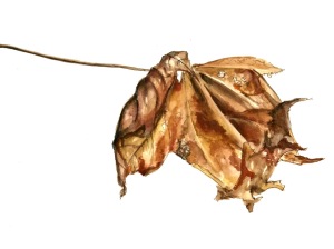
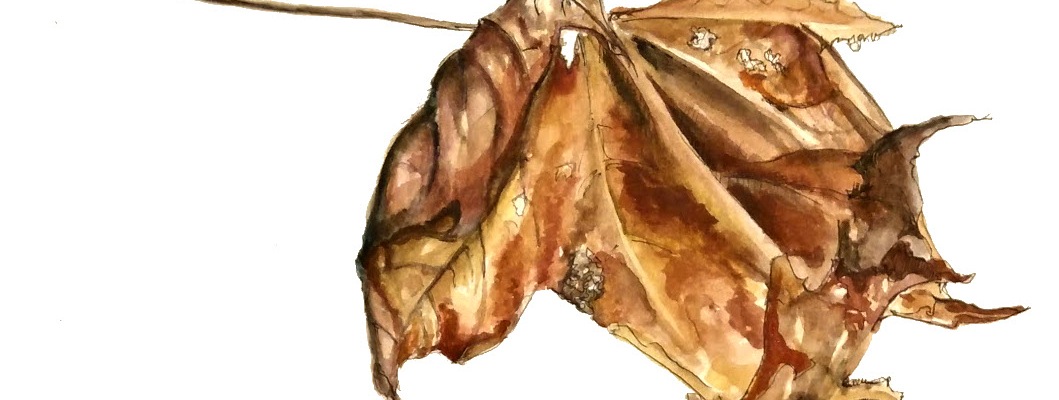
Daily Leaf 001 : Norway Maple (Acer platanoides) January 1st, 2018.
Oh… you didn’t think I would end this post without a leaf, did you?
Without further ado, here is my first #dailyleaf of 2018.
Daily Leaf 001 is a Norway Maple leaf picked up around the corner from my house.
Of course, I couldn’t just pick a simple flat leaf for day 1, I had to go for a huge crumpled up palmate leaf. This sketch is rendered in a little bit of everything – graphite, blue col-erase coloured pencil, watercolour, and ink – a reflection of how buzzy and excited I feel right now!
We’ve all been there – our artist friends are raving about XYZ watercolour brand, or the local shop is running a great sale on brand ABC. We’d love some new paints, but how to decide which paints to from a whole new brand?
The Problem
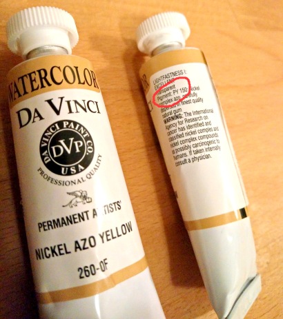
The trouble is, each brand makes up their own names for paints, and it can be hard to tell which paints we will like best. Two brands may offer paints with completely different names that are identical, or two paints with identical names that are completely different.
Pigment information on Nickel Azo Yellow Tube from Da Vinci
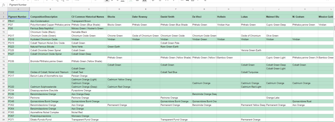
The good news is, there’s a much better way to sort your paints, which is by color index (pigment number). Artist quality brands have pigment numbers printed right on the tube, which describe the pigment(s) used to make up each paint.
However, trying to remember the pigment numbers of all of our paints (was that PR254 or PR255?), or finding pigment documentation for a different brand we’d like to try can be tricky.
This spreadsheet lists every single-pigment paint produced by 16 major watercolour brands, sorted according to their pigment number. This allows you to look up a paint by name or pigment number, and easily find all of the other paints made with the same pigment! Best of all, it’s completely free for the whole world to use.
How to Use
The Pigment Comparison By Brand spreadsheet is very simple to use. Each column is a brand, and each row is a pigment.
Scroll side-to-side to see the paints from a specific brand. Brands are sorted alphabetically.
Scroll up and down to view paints made with different pigments – paints are sorted alphabetically by pigment index number.
In cases where one pigment is used to make several different shades, multiple rows will be joined together to show all of the pigment variations. The convenient alternating colours allow you to see at a glance when multiple hues are made with the same pigment.
Search the spreadsheet by pressing Ctrl+F on your keyboard, and typing in your search terms. To look up a paint, search either the pigment number (found on the tube or packaging of all artist grade paints) or the name of the paint. Then scroll left and right to find other paints made using the same pigment. If your search returns multiple results, press Enter until you find the correct one.
This spreadsheet does not contain paints made with multiple pigments. However, if you have a mixed paint you like (for example, a specific brand of Sap Green), you can still use this spreadsheet to find the single pigments to mix your own. Simply check the tube or packaging you have at home to find the pigment numbers, and look those up in the spreadsheet.
The Catch
The catch? There is no catch!
However, I am an early-career artist working super-duper hard to “make it”. If you are using this spreadsheet to help you with your paint shopping, consider using one of my affiliate links – it won’t cost you a penny and I get a small percentage of every sale I direct.
Jackson’s Art: This is where I buy the majority of my watercolour paints. Jackson’s offers extremely competitive prices on all of the European brands of watercolour, and very affordable shipping (even to Canada!) Tax is deducted on international orders, which makes them even more affordable.
Amazon (Canada, US, UK): For assorted art supplies such as palettes, sketch paper and books, as well as all sorts of other products, I shop on Amazon. They sometimes also offer competitive prices on some watercolour brands, particularly American brands on the USA and Canada sites.
If you think I’m super cool and would like to reward me for my time and effort, you can also support me on Ko-Fi(buy me a coffee to help fuel the next stage of this or other projects!)
What’s Next
In the future, I plan to build on this spreadsheet. I want to make a simple search interface, and links to my colours swatches and reviews for each pigment/paint.
I am planning to incorporate lightfastness information for each pigment, as manufacturers can be inconsistent and misleading in their own documentation.
I would like to add more brands, particularly smaller, independent watercolour brands. If you have a brand you’d like added – feel free to send me a message, all I need is an up-to-date paint list with pigment numbers.
Also, feel free to contact me about any mistakes or suggestions for improvement. I tried to find the most up-to-date information from all brands and organize multiple hues of the same pigment in logical way, but I’m sure I wasn’t quite right in all cases.
More Info
While compiling this spreadsheet, I refered heavily to the Color of Art Pigment Database for in-depth pigment information.
I also relied on Jane Blundell‘s colour swatches and paint listings.
I strongly recommend both these websites to anyone who would like to learn more about watercolour pigments.
Without fail, at every one of my community shows, whether at KW Artists Co-op or in a local gallery or cafe, someone exclaims that they can’t believe my work is watercolour, because my colours are saturated and my linework so precise.
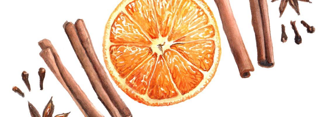
Orange and Spice – Watercolour on Paper
This always makes me giggle a little – in the realm of botanical illustration, a very traditional watercolour discipline, my lines and edges are downright sloppy! I have an interest in realism, and conveying scientific accuracy, but I have very limited patience for ultra tiny brushes and buffing. More patient watercolour artists that I can achieve much much cleaner lines using the same materials.
I love the puzzle of figuring out how all the little shapes in a complex subject fit together, and the thrill of building up colour, but when it comes to using teeny brushes to gently even out my gradations…I’m out. I’m working of finding my ideal balance between an economy of brushwork and preserving accuracy.
My colours are probably on the bright and saturated end of botanical painting, but still a ways off from the limits of the medium. In the orange and spice painting above, for example, the orange could be made even brighter and more juicy looking by gently working in some deeper shadows with small, saturated glazes in the areas of shadow. This would add more depth to the orange slice, making it look juicier, brighter and more three dimensional.
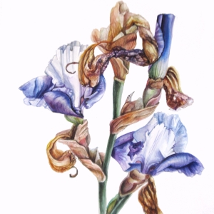
Dutch Iris – Watercolour on Paper by Lee Angold
Even amongst skilled watercolour artists in watercolour communities, there seems to be a fair bit of confusion about the properties of watercolour. A couple of weeks ago, there was a thread in one of the big watercolour facebook groups discussing transparency in watercolour. Many skilled watercolour artists were pointing at darker and more saturated paintings as “opaque” vs watery unsaturated paintings as “transparent”.
In fact, transparency is an attribute of the pigments used, not how much water or how light they look. There are very light-coloured, pastel-like opaque pigments and colours (think of gouache), and many of the most transparent colours appear very dark in masstone. When using transparent pigments, you can keep adding layers of the same or different pigments – each layer will be transparent and visually mix with the layers beneath, creating a darker and more complex colour. This is a way to use watercolour transparency to build up extremely saturated colours and delicate colour gradations.
In reality, what watercolour is, above all, is a very flexible medium. Dry artist-grade watercolour, whether in extruded pans or sticks, or just dried from a tube, is very nearly pure pigment, with just enough additives (gum arabic and/or honey and ox gall) to make it stick and spread smoothly. Being infinitely rewettable in plain old water, it can be thinned just a little to a thick, syrupy, ultra-saturated consistency, or watered down until it is barely tinted water.
Once applied to your paper or other support, more layers of thick or thin pigment can be added on top, again and again, building up deeper, darker and more complex colours. Alternatively, very delicate, watery washes can create an ethereal, wispy look, adding form to delicate light-coloured subjects or giving a dreamy look to a whole piece.
Creating sharp lines in watercolour is also easy. Using the point of a barely damp brush on smooth hot press paper, you can create lines more precise than even ultra sharp pencils. Watercolours will not spread where there is no water, so you can “paint” complex edges with plain water before applying coloured wet-in-wet washes to define the edges of a coloured shape. While your paint is still wet, you can apply a dry or damp clean brush to lift out highlights or soften ragged edges. Using these techniques, and building up colours in layers, you can achieve realistic effects and complex colour mixes that are much trickier to achieve in opaque or thicker media such as acrylic or oil paint.
Some artists push the flexibility of watercolour even further. I recently saw some paintings by an artist (who I can’t seem to track down) who makes really impressive textures in watercolour urban sketches using very thickly applied paint and a stick to scrape out wet pigment. The result looks like a textured resist – almost as though the painting was stamped in blocky colours on a support painted with wax.
Coneflowers by Candice Leyland
Wispy, ethereal, soft and unsaturated watercolour paintings are beautiful. I love looking at my friend Candice Leyland’s paintings, which all convey a calm, dreamy mood.
However, if you take a closer look at her work, and other loose watercolours, you will see that most loose watercolour paintings still have areas of sharp lines and some deeper shadows. The same techniques of washes and dry strokes, applied repeatedly in precise glazes over a painting to preserve highlights, result in a punchy and precise/realistic painting.
There is not a “right” way to use watercolour paints. Watercolour is a flexible medium that works well for loose, impressionist and watery looks, as well as fine and precise layered looks. All sorts of artists can benefit from the ultra-portable, infinitely rewettable, easily mixable attributes of watercolour paints.
The holiday season is gearing up. Every year, around this time, people start asking me what they should gift to the artists in their lives. in particular to loved ones interested in watercolour. I always find this such an awkward question, because art materials (and budgets!) are so individual!
I’m going to be blunt for a moment. If your artist is a professional watercolour artist who has been working in the medium for a while, I would stear clear of gifting paints/brushes/paper unless they have requested a specific item or you are VERY familiar with their practice and favourite/coveted materials. Artists can develop very specific preferences and each artist is unique
However, here are a few products that caught my eye as good quality giftables for artists of all levels:
This is set of 12 watercolour (whole pans !) in a plastic carrying case, made by St. Petersburg White Nights. White Nights is marketed as a professional grade paint, and have a bit of a cult following among students and other deal-seekers, who value their very low price point (below most student brands) and easy-to-rewet, saturated colour.
I would hesitate to classify White Nights alongside other artist grade paints, primarily because the brand (and this set) feature quite a large number of pigments that have been phased out by other watercolour brands for poor lightfastness.
However, the paints are a pleasure to use, very easy to rewet, and are bright, strong colours. For a university student who is using watercolour primarily for sketching and non-archival class work, White Nights definitely offers a great product at an amazing price.
This set of 12 whole pans packs a whole lot of paint (including some expensive cadmium pigments) into a portable, affordable package, perfect for the student on the go. It is a great first palette for a new artist, or a great stocking-stuffer upgrade for someone who has been painting with student-grade/craft paints.
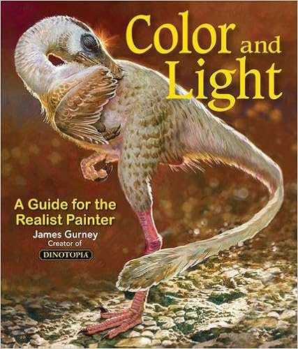
My two favourite art instructional books, hands down, are both by James Gurney. Gurney is the illustrator behind the Dinotopia series, a well-respected urban sketcher/plein air painter, and has also done work as an illustrator for large publications such as National Geographic.
Colour and Light: A guide for the Realist Painter
My most referenced art book of his, Color and Light: A Guide for the Realist Painter is absolutely packed with information. It is an extremely useful reference book for even the most advanced, professional painters, but is also clear and understandable enough, with lots of illustrations, to be useful and inspirational for even complete beginners.
The first part of this book deals with different kinds of light sources and lighting conditions, from sunny days, to indoor candlelight, moonlight and luminescence. For each type of lighting, Gurney gives illustrated examples, and tips about how to visualize and represent this kind of light in a painting.
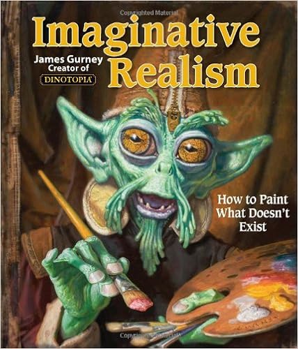
Imaginative Realism : How to draw what doesn’t exist by James Gurney
The second section of the book deals with colour choices in painting, from choosing pigments, to gamut mapping, effects of colour on the mood of a scene, contrasts, etc. The final section of this book deals with special lighting effects – dappled sunlight through leaves, reflections, shiny surfaces etc. Again, the whole thing is thoroughly illustrated with great examples.
The second book of Gurney’s, Imaginative Realism: How to draw what doesn’t exist is equally good, but less relevant to me personally because I mostly draw what is directly in front of me. It is a great reference for any fantasy artist or paleoartist looking to bring realism to their work with useful advice on finding and altering references, building models, lighting conditions, blending reality with inventions, etc. It is also useful for botanical and other realist artists as a reference for how to work with imperfect references (painting subjects out of season, building compositions, etc)
Watercolour is a great medium for sketching with, because it is so compact and portable. However, most sketchbooks contain lighter weigh paper which will warp and buckle when painted on.
If you know someone who sketches regularly and recently started watercolour, consider gifting them a sketchbook in their preferred size from Stillman and Birn
The Beta series has a lightly textured surface between a standard cold press and hot press watercolour paper. It is a beautiful, heavyweight paper which takes watercolour well but is smooth enough to draw pen/pencil details on and write on easily as well.
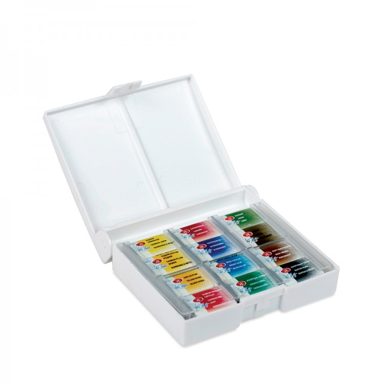
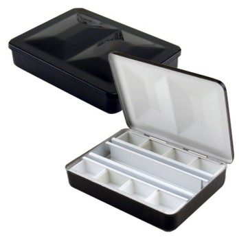
This 8-colour mini travel-palette can actually fit up to 12 regular half-pans, and it comes with a built in water flask and clip-on water cup, all in a quarter the volume of the two 12 pan sets above.
The Schmincke branded palette I linked is a good option for an artist who is just starting out with plein air/urban sketching in watercolour, and doesn’t yet have an artist quality travel set.
If your giftee is a serious hobbyist or artist who has been sketching outdoors for a while, they may already have paints they prefer to use. However, most urban sketchers would still appreciate the small form factor of this box.
I own the version without the flask, and it is my everyday carry palette. I love how compact this palette is, and how all kinds of different brands of half-pans (which are all subtly different sizes) are held neatly and securely by the simple fastening system.
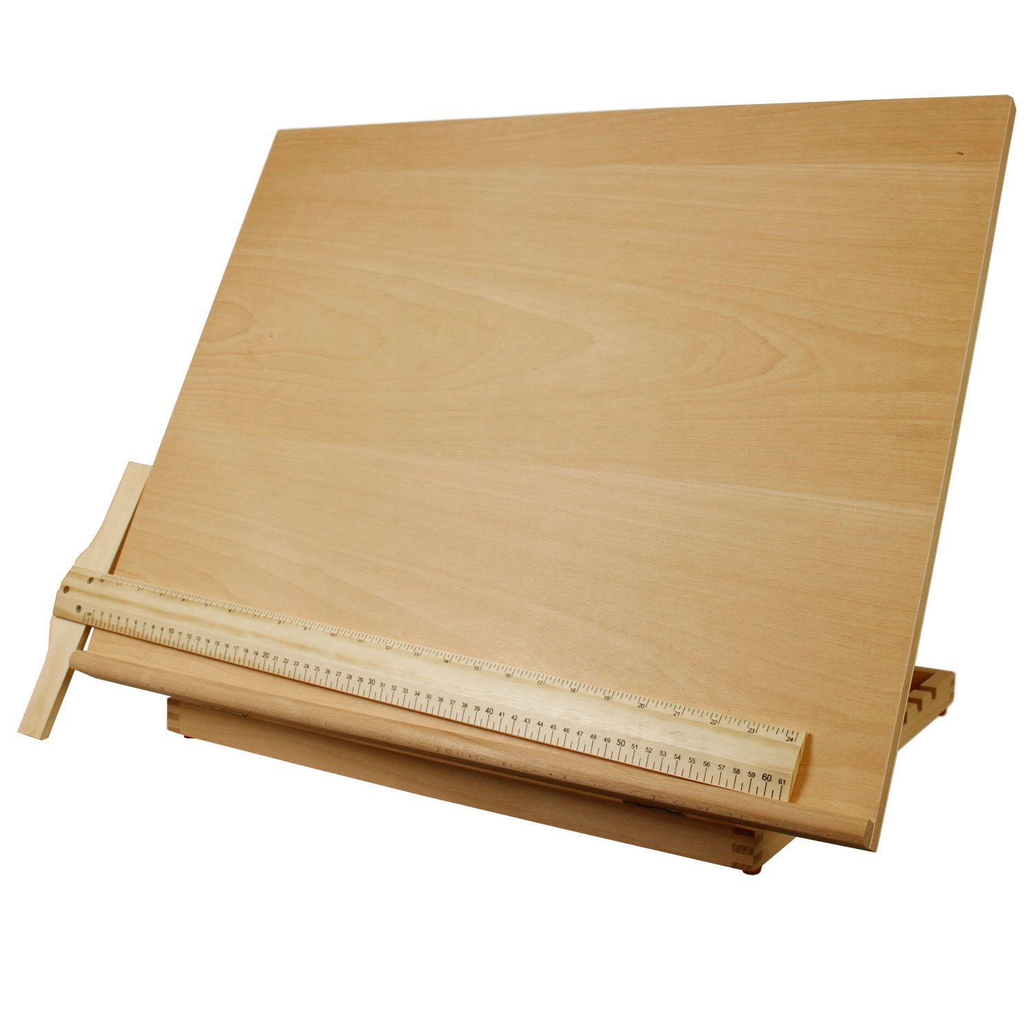
This may not be the cutest or most glamourous gift, but it can make the biggest difference in an artist’s life.
When I became a full-time illustrator, within a couple of months I was experiencing chronic tightness in my shoulders and shooting pains in my spine from hunching over large, detailed watercolour pieces for long hours at a time.
My tabletop easel/drawing surface was a belated birthday gift, and now I can’t imagine life without it. I am looking at buying 2 more – one for my secondary desk at the studio and one for home.
A large size and adjustable angle are key to a good desk easel but the brand is not important – due to the large size of these, you may find a cheaper alternative locally than Amazon shipping outside of the US and Canada.
Botanical artists tend to share slightly different paint preferences than other watercolour painters such as landscape or portrait painters.
Botanical painting tends to involve lot of bright, vibrant colours to render the full range of colours seen in flowers, leaves and fruit, as well as a high focus on transparent colours with excellent glazing properties.
This selection by Billy Showell contains a great range of vibrant and transparent colours selected for painting botanical subjects.
Although my own colour selection is quite different from this set, when I was just starting out in botanical art, these colours would have been much more satisfying and fun to work with than the generic starter set I had. The colours in this are mostly single pigment paints, mostly transparent with a good range of hues, and no white/black/blackened neutrals.
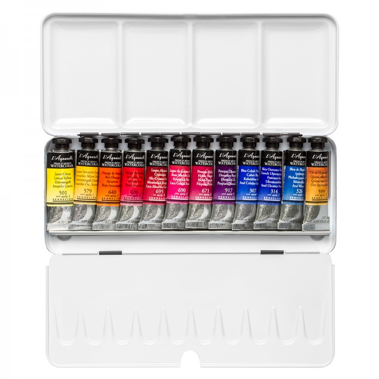
Sennelier is a good, artist quality brand – their honey-based paints are known for rewetting easily and glazing beautifully, perfect for many botanical art techniques.The paints in this set would all fit neatly in 12 half pans in the itty bitty Cornellison tin linked above, for a really indulgent gift for the ambitious beginner!
Remember when I said “you shouldn’t buy paints/paper/brushes for an artist, we mostly already have specific preferences”?
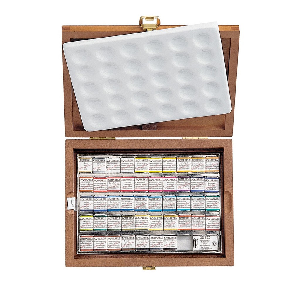
This is true, but the exception is over-the-top giant sets full of pretty artist-grade colours. Luxurious wood boxes with perfectly fitted ceramic palettes also help. I know very, very few artists who wouldn’t look at a set like this one and be delighted.
I already have all the colours any regular human needs. My studio palette is larger than this one and contains a personalized selection of colours from many different brands. This set contains lots of colours I have no intention of buying, or have tried and don’t use much. It is not remotely a sensible purchase, and yet it makes me drool.
One design element I really love about Sennelier sets is that they all come with a laminated colour chart showing all of the colours in the set. Given my preference for swapping out paints and mixing and matching, it isn’t a particularly useful feature. However, I really appreciate this attention to detail and it is a neat design element, particularly in a gift set
THIS POST CONTAINS AFFILIATE LINKS. LEE ANGOLD IS A PARTICIPANT IN THE AMAZON SERVICES LLC ASSOCIATES PROGRAM AND THE JACKSON’S ART AFFILIATE NETWORK. THESE ARE AFFILIATE ADVERTISING PROGRAMS DESIGNED TO PROVIDE A MEANS FOR SITES TO EARN ADVERTISING FEES BY LINKING TO PRODUCT LISTINGS.
I’ve been vegetarian for over 20 years, nominally for ethical reasons. I eat some dairy and eggs, but the majority of my meals are mostly vegan. I am bothered by the idea of raising and slaughtering animals, particularly in modern factory farms. I am also concerned about the larger land and carbon footprint of eating higher up on the foodchain.
My ethical views are somewhat nuanced – while the scale of animal consumption and cruelty bothers me, I am also aware that a purely vegan lifestyle up here in the great white north isn’t exactly sustainable either. Being vegan where I live would be nearly impossible without the heavy use of fossil fuels for transporting fresh vegetables and producing synthetic insulating fabrics. I’m not going to delve too far into it here, but I’ve made a conscious choice to wear (mostly, but not exclusively second hand) wool and leather, I don’t fuss about by-products, I’ve definitely ingested fish-sauce and lard at restaurants, and I am comfortable with that.
However, if I’m truly honest, my ethics are pretty flimsy. Nowhere is my ethical ambivalence more obvious than in my art supplies. Every part of my art “kit” contains some kind of animal products, and none of them are truly necessary, they’re just convenient indulgences. I don’t really feel guilty about it, but I also recognize and admire that others may be more interested in making cruelty-free choices.
In the following sections, I’ll describe all the common hidden animal products in a regular watercolour kit, what they’re used for, and some possible alternatives.
Brushes
My “nice” brushes, which I use most frequently in my watercolour work, are nearly all made with animal hair.
My “best” brushes which I use for most of my detail work, are Kolinsky sable brushes, made from the tail hairs of male the Kolinsky weasel (not actually a sable at all). These have great liquid retention, and a very soft but super-springy point, which allows me to paint long lines, fine details and larger areas with only one brush. The weasels, which are prevalent in northern Eurasia, are trapped for their pelts.
I also have a couple of large “mop” brushes for large areas, made with squirrel hair. They are incredibly soft and hold a huge volume of water and dispense it smoothly, ideal for making large, even washes. Squirrels are farmed or trapped, and killed for their pelts.
Other watercolour brushes may include various other animal hairs such as red sable, badger, etc.
Synthetic brushes, made using nylon or acrylic hairs, are widely available and often cheaper. Synthetic brushes tend to be a bit harder/rougher than the sable or squirrel brushes traditionally used for watercolour. This can be a useful quality for lifting/scrubbing away dry pigment, but can often lead to a streakier look when painting wet in wet or large washes. They also almost invariably have a lower water capacity, which can be a little bit easier for beginners to manage, but makes it more difficult to paint a large area or long line in a single stroke.
Comparison of Detail Brushes : Midrange Synthetic vs. “High End” Kolinsky Sable. From left to right : Size 5/0 Synthetic (3 Years old), Size 3/0 Synthetic (2 Years old), Size 0 Kolinsky Sable (4 Years Old), Size 2 Kolinsky Sable (2 Years old). The sables get much more use and abuse and are older and larger sizes, yet have a much finer point.
Finally, synthetic brushes tend to lose their point and splay out more quickly than good natural hair brushes, which use the natural tapered and curved point of the animal hair to craft a point which springs back time after time. For this reason, synthetic brushes may need to be replaced more frequently than animal hair ones.
Some companies have recently put a great deal of effort into creating very high quality synthetic brushes. Silver Black Velvet brushes, for instance, are rumoured to rival the water retention of natural squirrel hair and deliver a soft brush point. Escoda Versatil brushes are what I use as travel brushes – they are quite durable and have good water retention, although they lack the soft-springiness of my best Kolinsky brushes.
Paints
Watercolour paints are often formulated with ox gall and/or honey, and some pigments are made with animal products
Ox Gall is a wetting agent, which increases the rewettability and flow of watercolour. It is made from, you guessed it, the gall bladder of an ox (or more frequently, a cow). Ox gall is a common ingredient which many watercolour paint brands mix right into their prepared tubes and pans. It can also be purchased as a watercolour medium to add to your paints.
Schmincke produces a synthetic ox gall product, which I believe they use as a wetting agent in their paints as well. Holbein advertises that they use no ox gall in their paints.
Honey is used as a binding agent and to keep watercolours semi-moist and easy to rewet. A few brands, notably M. Graham, Yarka St. Petersburg and Sennelier, use a very honey rich formula in their paints, which results in a semi-moist consistency in the pans.
I personally think that the beekeeping industry is a great advocate for the environment and have no ethical problems whatsoever with honey. I also love the consistency of honey-based paints, so I specifically seek them out. However, most large brands (excluding the three listed) do not use honey, if thjs is something you wish to avoid.
Luckily for those with ethical concerns, most animal-based pigments have been discontinued as most were not very lightfast. Ivory Black(PBk9) is made with charred animal bones – watch out for it in some mixed pigments such as Neutral tint or Indigo. In general black pigments are easy to avoid in watercolour, and there are other non-animal blacks. Some companies still produce Genuine Carmine (NR4) – I would rank it’s terrible lightfastness as a greater concern than the fact that it’s made with ground up beetles 😉 Just use quinacridones.
A few indie brands have popped up that formulate exclusively cruelty-free paints which do not contain ox gall, honey, animal pigments or any other animal by-products. One of my favourites is Eventually, Everything, Mixes – the paintmaker, Amé, also seeks out unique and environmentally friendly pigments for her beautiful, unique paints.
Paper
What, even my paper contains animal products? That’s right, watercolour paper is treated, or “sized”. The sizing is what keeps the pigments sitting on the surface of the paper, rather than sinking and feathering across all of the paper fibres Sizing is traditionally made with animal gelatin, although some papers are made with starch or synthetic gelatin rather than an animal product.
Bockingford, Canson Moulin du Roy, and Fabriano Artistico papers are sized without animal products
It goes without saying that vellum, another traditional surface for watercolour, is also not cruelty-free, being made from stretched calf or goat skin.
EDIT: Further clarifications about vellum, as I’ve drawn the attention of a few great artists who use vellum as their primary surface 😉
Vellum (and other skins) are considered a by-product, like gelatin or ox-gall. No calves or goats are directly raised or slaughtered for their skins. Skins are a waste by-product of the meat industry, and many skins end up in landfill as the demand for meat far outstrips the demand for vellum and other leathers. However, like other by-products, the purchase of vellum supports the primary meat industry.
Vellum has several unique qualities – in addition to a mostly impermeable surface it also has a unique semi-transparent finish and shows the skin texture and patterning of the animal. Each piece of vellum is a unique item.
The impermeable surface of vellum can be mimicked, to some degree, with synthetic alternatives. One interesting alternative is Terraskin, a paper alternative made of rock in a plastic binder. It has many of the same handling properties as vellum, with a smooth, non-absorbent surface that allows the paints to sit on top and glow rather than sinking into the surface, It is much cheaper, available in larger sizes than vellum, and of course, cruelty free. However it lacks the variable translucency and unique character of vellum.
Working as a primarily watercolour artist, I have heard some frequently repeated myths from customers as well as other artists, which I would like to dispell.
The first myth I hear very frequently is “Doesn’t watercolour fade?”.
The short answer is no, my watercolour paintings will not fade. In fact, most watercolour paintings you buy from professional artists should be just as durable as other media, especially if framed behind conservation glass.
Paint Composition
Watercolour, like most other artistic paint media such as acrylic paint, oil paint, etc, is composed of pigments held together with a binder. For oil paint, this is a drying oil such as linseed oil or walnut oil, for acrylic this is an acrylic emulsion (a synthetic plastic product that hardens in contact with air).
The primary binder in watercolour is gum arabic, a resin made from acacia sap, and sometimes honey. Gum arabic and honey are no more prone to discolouration or other long term effects than other binders. In fact, oil-based binders have a tendency to yellow over time, as do acrylics (which as a newer media, have not yet stood the test of time).
Pigments are naturally occuring and synthetic colourful chemical compounds, which paint manufacturers mix with binders to create paint. In modern days, we are spoiled with a wide variety of stable pigments, thanks to global shipping and modern chemistry. With a little bit of care, artists in all media can use a palette of extremely lightfast, durable colours which will not fade or change colour under any circumstances.
In the past, artists had very limited choices in some parts of the colour spectrum. For instance, before modern lightfast synthetic rose colours such as Quinacridone Rose (PV19) became available, artists had no choice but to use less reliable pigments such as Alizarin Crimson (PR83 ) or extremely fugitive genuine carmine (NR4).
Lightfastness is a problem across all media, not just watercolour
Portrait of Charles Churchill, by Joshua Reynolds. National Gallery of Canada
Poor lightfastness is by no means unique to watercolours. Oil or acrylic paintings made using carmine or other fugitive pigments will also eventually fade. To the left is a portrait of Charles Churchill. It now looks ghostly, but when it was originally painted, the subject’s cheeks were likely rosy, and the coat a deep red, through the extensive use of carmine and other fugitive pigments, long since gone.
However, in oil paint, the thicker paint film provides a small amount of UV protection, so an oil painting using fugitive paints may last a little longer than an unprotected watercolour framed behind clear glass.
Modern artist-grade paints are generally not made with highly fugitive pigments such as carmine anymore. However, some specialty paints (such as neon paints and some common brands of liquid watercolours) as well as cheap scholastic grade paints, are made with fugitive dyes instead of traditional pigments (again, this is equally true in non-watercolour media). In addition, some pigments with limited lightfastness are still used in artist paint lines (for example, alizarin crimson is still a common pigment which many artists use. While more durable than carmine, alizarin still has a significantly lower lightfastness than similar quinacridone-based pigments)
How much do you really care about lightfastness?
Cote-des-Neiges Oil Landscape by Carly Leyburne
Some artists prefer to use impermanent materials for immediate impact, rather than creating artwork that will last centuries. Most popular mixed-media, collages including newspaper clipping or plant matter, resin etc are prime examples of this. Similarly, some painters use neon paints, which are virtually all fugitive.
There’s nothing wrong with buying and displaying art for your enjoyment that won’t last forever. For example, I purchased the beautiful oil painting shown on the right (by my studio mate Carly Leyburne) as a statement piece for my dining room. The hot pink trees are painted with an oil paint that includes a rhodamine dye, which will eventually fade. I am not concerned. It looks fantastic right now. We’ll cross the fading bridge when we get to it. I may be old and senile by then anyway 😉
If you are unsure of the pigments used in your watercolour paintings, and would like to ensure they stay looking bright for years to come, framing your art behind conservation glass (which offers significant UV protection) and not hanging it in direct sunlight can dramatically slow any fading in both watercolour and other media.
How to ensure you are creating lightfast art
I am happy to buy any art that catches my eye, with little concern for archival qualities. However, as a seller, I do feel compelled to stay one step ahead, and ensure that my artwork will continue to look bright and fresh, regardless of how my customers choose to frame or display it.
If you are an artist looking to produce artwork that will last for centuries, you can ensure the durability of your pieces by eliminating pigments from your palette which do not have an “excellent” or “very good” lightfastness rating.
The most durable pigments should last centuries without discernable change, given proper framing and protection. Below, I’ve listed a few common paints to watch out for, as well as alternatives. This list is by no means exhaustive – do your homework and research the specific paints that you use if lightfastness is a concern for you
“Opera Rose” and other paints containing rhodamine dye (BV10): Probably the least lightfast paint in most modern paint lines, “Opera Rose” is a hot pink, popular with botanical artists looking for the brightest colour. Usually formulated with PR122 (Quinacridone Magenta) and rhodamine B dye. The rhodamine is highly fugitive, if exposed to sunlight, this will lose brightness, fading back to the (still fairly bright, but not neon) PR122. A safer alternative is to just stick with Purple Magenta (PR122) to begin with.
Alizarin Crimson (PR83): An early synthetic and once the most stable “cool” red, Alizarin Crimson is a relatively dull, deep rosy red. It is now considered relatively fugitive compared to the many available permanent red pigments. Many modern paint manufacturers still offer Alizarin Crimson, and it is favoured by portrait artists and traditionalists over the brighter, modern quinacridone rose (PV19) for mixing skintones and rosy lips because it is slightly muted. However, it isn’t very permanent. Many brands offer a “permanent alizarin crimson” formulated with quinacridone red (PR206) or redder shades of quinacridone violet (PV19). I use Quinacridone Rose (PV19) or Purple Magenta (PR122) for most mixing, and Perylene
Hansa Yellow Lemon (PY3 and PY1): The moderately lightfast Hansa Yellow Lemon (PY3) is one of the most common lemon yellow pigments available. It is much more transparent and highly tinting than other pigments in this range. PY3’s close cousin PY1 (also a Hansa Yellow Lemon) is even less lightfast, yet is still available in some paint lines. An increasing number of paint brands have started offering Lemon Yellow paints made with PY175 , an azo lemon yellow with a “very good”lightfastness rating.
Dioxazine Violet(PV23): Present in nearly every watercolour line, dioxazine violet varies in lightfastness depending on manufacturing. It is a deep, saturated, transparent and non-granulating bright cool violet colour, in a portion of the colour wheel with relatively few pigment alternatives. It is also a relatively inexpensive pigment, whcih no doubt contributes to it’s enduring popularity. There is no single pigment replacement for dioxazine violet, however, hues can easily be mixed from a warmer violet shade such as quinacridone purple (PV55) and a splash of a blue.
Rose Madder Genuine: Most brands have discontinued this pigment, but Winsor Newton have made it their flagship colour. The Winsor Newton paint is scented with bergamot – originally to please Queen Victoria. It is a slightly muted, liftable colour similar in hue to Quinacridone Rose (PV19) but lighter and more muted. Just use quinacridones. For a muted pink with some granulation, try Potter’s Pink (PR233)
THIS POST CONTAINS AFFILIATE LINKS. LEE ANGOLD IS A PARTICIPANT IN THE AMAZON SERVICES LLC ASSOCIATES PROGRAM AND THE JACKSON’S ART AFFILIATE NETWORK. THESE ARE AFFILIATE ADVERTISING PROGRAMS DESIGNED TO PROVIDE A MEANS FOR SITES TO EARN ADVERTISING FEES BY LINKING TO PRODUCT LISTINGS.
After my latest post (a tour of my huge studio palette), I received several requests to post a similar “palette tour” blog entry for what I call my “Greatest Hits” palette, a collection of full pans of my 14 most commonly used colours.
My Greatest Hits Palette – A well-loved collection of 14 full pans of watercolour
The idea behind this palette was to curate a selection of paints that I could take out of the studio for travel or home use which would allow me to paint a large range of botanical and plein-air urban sketching subjects in a relatively portable way (although this palette is still relatively bulky), as well as facilitating my work in the studio and out by enabling me to load larger quantities of my frequently used colours easily.
I’ve been delaying writing this post for a few weeks, because although I have been using this palette regularly for several months, as both a travel palette and in the studio, over time I’ve come up with several changes I intended to make to it as I used up the paints currently inside it. I couldn’t decide whether I should profile the palette as I’ve been using it, or my current (and ever-evolving) lineup of “ideal” colours.
However, last week I decided to order an all-new full-pan palette from Ebay. The new palette is thinner and more compact than the current palette, yet holds up to 24 full pans. The picture below shows the half-pan version of the same palette, which I ordered to use as a studio palette in my home studio.
New Palette Format size comparison with Studio Palette
The practical upshot is that sometime in the next few months, my “greatest hits” palette in it’s current format will cease to exist, being replaced with a much larger selection of paints. However, I still think it is useful to keep track of my paints in terms of smaller curated collections.
Therefore, I will give you a tour of what is currently in my “greatest hits” 14-colour palette, and discuss what I would change, or which paints I could eliminate in even smaller palettes.
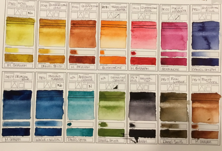
The image below is the swatch sheet I made of the colours in my current “Greatest Hits” Palette. The template I used was designed by the amazing Sade of “Sadie Saves the Day”, who sells the templates as digital downloads in her shop :
Swatches of Watercolours from my “Greatest Hits” palette
In the listings below, I’ve included (affiliate) links to my favourite paints. As always, I’m trying to find the best prices for most of my viewers. American brands have Dick Blick/Utrecht links, European brands are listed with Jackson’s links. All have reasonable shipping fees around the world. However, if you are in Canada, the Daniel Smith/M.Graham paints are available more affordably at Deserres and Curry’s, respectively. The colours contained in this palette are:
PY150 – Nickel Azo Yellow – M. Graham: My favourite yellow, hands down. Truly transparent, no milkiness and a beautiful middle yellow in tints. Mixes beautiful greens and subtle oranges. Lovely in glazes. Forever in my faves.
PO49 – Quinacridone Gold – Daniel Smith: Recently discontinued by Daniel Smith, the last remaining manufacturer, this is a good transparent alternative to Raw Sienna or Yellow Ochre, and works beautifully as a glazing colour. I have a few backup tubes stockpiled, but a good convenience mix is available from most brands (usually made with PY150 and PO48, the two neighbouring pans). In a smaller set, or if I run out of the single pigment, I would simply mix PY150 and PO48
PO48 – Quinacridone Rust – M. Graham: A beautiful earthy orange hue, this particular formulation of this pigment has given me no end of grief . Although I love the saturation of this paint, I’ve decided I just can’t deal with the weird curdling behaviour for my formal paintings. I’ve already replaced it in my studio palette with the similar Da Vinci paint, which is a slightly browner tone. It will be years before I run out of the Da Vinci, but I’m also curious to try the Daniel Smith Quinacridone Burnt Orange, which is apparently slightly more orangey.
PO71- Translucent Orange – Schmincke:A beautiful, transparent fiery orange. I like this paint a lot, but I like the QOR version of the same pigment slightly more, I think. It has less of a drying shift, which also makes it a more vibrant orange. It will be replaced when I run out.
PR122 – Purple Magenta – Schmincke:My choice for a primary magenta colour, a really pretty transparent clear magenta, very slightly on the violet side.
PB60 – Indanthrone Blue – Daniel Smith: Darker and moodier than the more common ultramarine, this is my choice for a red-biased blue. Mixes vibrant purples with PR122, neutral greys with PO48, and interesting greens with PY150 and PO49
PB27 – Prussian Blue – M. Graham:Another dark and moody blue with great mixing properties, this one slightly on the green biased side. Has a challenging drying shift but is very useful nonetheless.
PB16 – Phthalo Turquoise – Winsor Newton: Another clear favourite, the final part of my “primary triad” of PY150, PR122 and PB16. Oh so pretty, deep and transparent.
N/A – Amazonite Genuine – Daniel Smith:A slightly more turquoisey version of Phthalo Green or Viridian, not as aggressively staining or pigmented as the former, much easier to rewet than the latter. I originally thought this was a silly vanity purchase, but I find this paint finds it’s way into nearly every painting.
N/A – Serpentine Genuine-Daniel Smith: An interesting sap green colour with tiny, nearly imperceptible purplish/brown flecks ground from natural serpentine. Kinda goofy convenience colour which could be left out of a smaller palette. I love it and get a lot of use out of it rendering foliage and lichen. I have the stick format, which is much better value for money than the tubes.
PG7 + PV19 – Neutral Tint – M. Graham:Another otherwise great M. Graham colour that curdles unexpectedly with my water/climate. This is a genius convenience mix. Nearly black and slightly purplish in masstone, it mixes beautifully with rose and red colours to make deep plummy shadows, works as a complimentary shadow colour for yellows, and deepens greens well too. I’m working on mixing my own dupe with non-curdling colours.
PBr7 – Raw Umber – Daniel Smith: This is my go-to dark earth colour. Nice granulation, plays nicely in mixes and glazes to make all kinds of earth, stone and treebark colours/textures.
PBr7 – Burnt Sienna – M. GrahamChosen for it’s granulation and because so many artists seem to favour this pigment. It’s nice, but I don’t consider it essential with PO48 and Raw Umber in the palette. Would likely replace it with PW6 Titanium Buff, which seems like an oddball choice but I find really useful for mixing glaucous/hazy textures on leaves, fruit and lichen, particularly with Amazonite. Or leave it out altogether, in a smaller palette.
So that’s it – a useful mixing collection of 14 colours. I know I have some unusual picks in there, but they work well for me. What are your favourite mixing colours? Favourite unusual pigments?
THIS POST CONTAINS AFFILIATE LINKS. LEE ANGOLD IS A PARTICIPANT IN THE AMAZON SERVICES LLC ASSOCIATES PROGRAM, UTRECHT ART AFFILIATE PROGRAM, DICK BLICK AFFILIATE PROGRAM AND THE JACKSON’S ART AFFILIATE NETWORK. THESE ARE AFFILIATE ADVERTISING PROGRAMS DESIGNED TO PROVIDE A MEANS FOR SITES TO EARN ADVERTISING FEES BY LINKING TO PRODUCT LISTINGS.


 Penholder Art is, I believe, one of only 2 remaining small manufacturers of real unadulterated PB33 Manganese Blue paint, an absolutely beautiful electric blue pigment that has been discontinued from pigment production due to toxicity. Penholder Art also produces several other rare paints made with toxic/discontinued historic pigments.
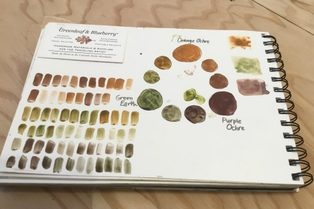
 I am a strong believer in the power of daily habits, both in art and in life generally. I’ve been impressed with my progress during past daily challenges