Handmade Watercolour Brands

Most of the watercolours in my collection are from established brands such as Schmincke and Sennelier.  However, there is another option for purchasing watercolour paints.   Independent watercolour makers are a growing industry.

Buying watercolours from handmade paint makers is one way to try out unusual pigments.  Indie paint makers buy powdered pigments from sources such as Kremer Pigments, or collect their own natural pigments.  Handmade brands sometimes offer pigments that are not available in larger brands.

Buying from an indie paint maker is kind of like buying usable art.  The personality of each paintmaker shows through their packaging, colour selection, marketing, etc.  Many handmade brands also have curated paint collections with a consistent “look” or personality to their paints.

Handmade watercolour paints are not a budget option – the high manual labour cost of making watercolour in small batches means that indie paint brands tend to be more expensive than commercial brands.  (Some) indie paint brands can also be frustrating, as indie paint makers may use creative names for common pigments, advertise fugitive paints as lightfast, and do not publish pigment information.

My favourite handmade watercolour brands

Here are a few handmade watercolour brands I love.  I have had amazing experiences with these brands:

Pruche

Made by the lovely Eve Bolt in Montreal, Canada, this brand was my introduction to handmade paints.  Eve made a great series about her paintmaking experiments when she first started mulling paints.  Pruche offers a small but solid range of earth colours and bright synthetic pigments including common favourites and a few uncommon (and uncommonly beautiful) earth colours.

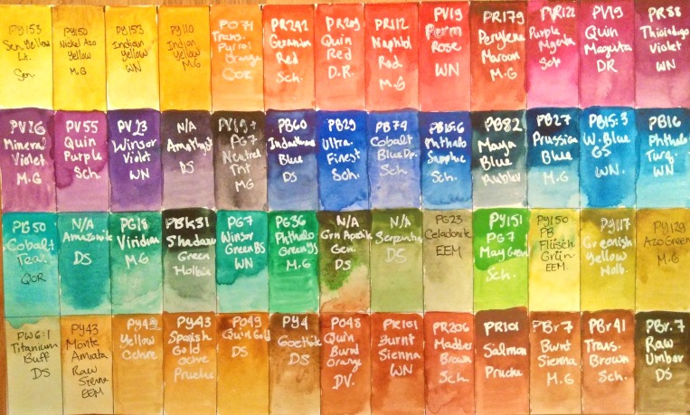
Pruche paints have clear and concise pigment documentation in the listings, on the packaging, and directly on the pans, which I strongly appreciate. Pruche paints have a pleasant, even consistency, strong pigment load, rewet readily and are neatly poured into, in her words,  “the nice pans from Jackson’s” (Eve and I agree on this point, the half-pans at Jackson’s are much nicer than many other half-pans on the market).

Muted Primaries
Muted mixing chart featuring two earth colours from Pruche (Salmon and Spanish Gold Ochre)

Pruche paints are an ideal choice if you are looking to supplement or replace a basic collection of commercially made paints.  Her use of primarily single pigments and great pigment documentation make it easy to shop for both well-known pigments and unusual extras.

I have used Pruche paints (in Spanish Gold Ochre, Prussian Blue, and Salmon) as the inspiration for a limited gamut travel palette I recently built, and will tour in my next blog post. Like many brands, Eve posts her shop updates on Instagram

Everything, Everything Mixes

These are mad scientist paints.  I strongly, strongly recommend making friends with EEM’s creator, Amé, on Instagram.  There, you’ll learn how she sources all kinds of rare and unusual pigments, and then mixes them up into moody, granulating, crazy, colourful, misbehaving magic paints that also happen to be vegan and smell like cloves.

EEM
Special Delivery from Eventually, Everything Mixes.

She makes paints out of ground up epidote and burnt green earth and the rare bluer shade of cobalt teal which she found in some hole in the wall shop in Berlin. If you buy Flüsch Green (a spring green made with the unique PB71 Zirconium Cerulean) she’ll ship you a multimedia painting of one of her cats.

My EEM paints are fun paints.  They’re more of a wild ride to use than strictly practical (although I have found practical uses for them – the Flusch Green is actually perfect the bright springy undertones of many plants).

Penholder Art

If you’re a pigment geek  or history buff looking for the highest pigment load, or rare discontinued pigments, Penholder Art is the handmade paintmaker for you.

Manganese Blue PenholderPenholder Art is, I believe, one of only 2 remaining small manufacturers of real unadulterated PB33 Manganese Blue paint, an absolutely beautiful electric blue pigment that has been discontinued from pigment production due to toxicity.   Penholder Art also produces several other rare paints made with toxic/discontinued historic pigments.

Penholder Art is a relative newcomer to the paintmaking world, and slightly rough around the edges.  Packaging can be slightly messy and some paints can be a little sticky/messy.  However, Dan from Penholder Art is very friendly and approachable, and offers fantastic prices on some of the most saturated and vibrant paints I have ever seen.

Other indie brands

Greenleaf and Blueberry

The (relative) giant in the handmade  watercolour world is Greenleaf and Blueberry.  They have a massive social media cult following, which allows them to post flash sales which sell out within minutes.

Greenleaf and Blueberry Swatches (Not Colour balanced)
Greenleaf and Blueberry Colour Test Page (Not Colour Balanced

In September 2017, I managed to catch one of these sales, and impulse bought myself a little earth secondary triad of three whole pans.  They are nice paints, but after taxes and shipping and duty, cost me over $120 CAD, or over $40/pan (for earth colours!).  I honestly can’t imagine any paint, no matter how revolutionary, being worth that much money, and these paints are just nice.

For comparison, I swatched out some similar colours from other handmade and commercial brands, which were all less than a third of the price.  All these paints rewet and granulate similarly and are equally saturated.

71a8c2b2-f25d-49a2-a6cd-96451cdc3327
Comparison of Greenleaf and Blueberry Paints with EEM, Pruche, Daniel Smith and Da Vinci Paints

On the far left to right we have Celadonite Green Earth by Eventually, Everything Mixes, compared to Green Earth by G&B.  I had trouble getting a saturated pigment load from either as I’ve done in the past, perhaps because of the super dry and cold weather.  However, these two paints are nearly identical.  The EEM paint is about 1/3 the price per volume.

In the middle, I compared Purple Ochre to Piemontite Genuine (Watercolour Stick) by Daniel Smith, and Mars Violet by Pruche, which are both very similar but slightly more reddish than the G&B paint.  Both the Daniel Smith and Pruche paints rewet much more easily and are more saturated.  The Pruche paint is around 1/3 the price per volume, and the Daniel Smith sticks are a great deal, at about 1/8th the price per volume.

On the right, I compared Orange Ochre to Spanish Gold Ochre by Pruche, as well as Raw Sienna by Da Vinci.  The gold ochre is slightly more yellow, and the Raw Sienna is slightly browner, but they are all very similar and equal saturation (although both handmade paints required some coaxing to rewet in this dry weather). The Spanish Gold Ochre, again, works out to about 1/3 the price, whereas the Raw Sienna, always an affordable paint, I got on clearance sale for $5 for a 37 mL tube (which I think works out to about 1/16 the price or less).

I was hesitant to post this review, because Greenleaf and Blueberry is a cool company who make an effort to source unique pigments, and they really are good paints.  If money is no object, Greenleaf and Blueberry paints are great.

However, I wanted to post an unbiased review to cut through some of the social media hype. If you’re on a budget, you can get very similar paints without spending nearly so much money, and even support smaller handmade paint makers in the process.

Other Brands

There are also a great many other handmade watercolour brands I am less familiar with. A few brands I watch out for are Peppercon Arts, Wanderlust WC, Hushwing Watercolours, Rivervale Watercolor and Ruby Mountain Paint Company .

Do you have a great handmade watercolour brand to recommend? Let me know in the comments!

THIS POST CONTAINS AFFILIATE LINKS.  LEE ANGOLD  IS A PARTICIPANT IN THE AMAZON SERVICES LLC ASSOCIATES PROGRAM AND THE JACKSON’S ART AFFILIATE NETWORK.  THESE ARE AFFILIATE ADVERTISING PROGRAMS DESIGNED TO PROVIDE A MEANS FOR SITES TO EARN ADVERTISING FEES BY LINKING TO PRODUCT LISTINGS.


2017 Watercolour Palette Tour – Introducing the giant 52-pan monster

It’s been a while since I shared what’s in my watercolour palette

52 Colour Chart - 2017 - Yellow, Orange, Red, Magenta
52 Colour Studio Palette  Colour Swatch Sheet
41toVKknRVL
Meeden Palette – Empty

A few months ago, I purchased a Meeden 48 Half Pan Watercolour Palette and Pans to house my evergrowing collection of watercolour paints.  I recommend buying one of these tins if you want an empty standard tin like the ones sold by WN, Schmincke, etc at a lower cost.  They are available in a variety of sizes, with or without pans included.

Like in most similar boxes, it is usually possible to fit one extra pan per row (for a total of 52).  Actually, the Meeden half-pans are a little thicker than other ones so you won’t be able to fit the extra pan if you only use Meeden pans, but as I have some pans from other brands, I was able to squeeze them in.

meeden palette
Meeden Palette – In Use

Like most of the lightweight tins, the large Meeden palette has two fold out mixing areas (the inside of the lid, and one on the opposite side.  As well, there is a centre tray that holds the pans which can be lifted out as well, and the inside of the tin underneath can also be used for mixing.  I generally prefer to use a ceramic plate for mixing, and I am actually considering removing the second flap so the box will take up less space when open.

Here is a painted out colour swatch sheet of the colours I keep in this box with labels.  This swatch sheet is kept in a sketchbook for reference.

52 Colour Chart- 2017 - Labelled
52 Paint Colours in my Studio Half-Pan Palette – 2017 – Swatches with Labels

Continue reading

The search for transparent yellow

I’ve realised that not only am I generally a fan of transparent,non-granulating pigments in watercolour, I am particularly fussy about this preference when it comes to yellows.  I can enjoy a fair bit of granulation and opacity in mossy greens and browns (great for adding visual weight to heavy foliage, bark and rocks).  The opacity of Cobalt Teal is what gives it that absolutely yummy irresistible bright colour in the pan.  Softly granulating, semi-opaque manganese and cobalt violets are great for laying in shadows, and even one of my favourite primaries, Purple Magenta (PR122) is far from transparent.  But even the smallest hint of milkyness in my yellows makes me gag.  In my ideal world- all yellows would be like clear, pure liquid sunshine.

This is a stroke of terrible luck on my part.  Whereas transparent pigments abound in some sections of the colour wheel – there’s a transparent, non-granulating phthalo pigment for every shade of blue-green you can imagine, transparent yellows are few and far between – the most common yellows being opaque cadmiums or semi-transparent azo and hansa pigments.

As a result, for the past year, I have basically used one yellow pigment, PY150 (Nickel Azo Yellow or Transparent Yellow) for all my yellow needs. I do also use small amounts of Green Gold (PY129) and Quinacridone Gold (PO49), which are arguably also part of the yellow family, but PY150 is the only “true”  yellow I have used in a painting in the past year.

Nickel Azo
My single yellow – PY150 Nickel Azo Yellow by M. Graham

As an unapologetic pigment magpie – at last count I had 15 blues in my half-pan palette, most of which I find a use for regularly, my yellow section has been relatively anemic.  I do keep some Hansa Yellows PY3 and PY97 I tried and never took to, along with my trusty PY150.  On somebody’s recommendation, at one point I also bought M. Graham’s PY110 Indian Yellow, which is a lovely colour, but also rarely used (and really more of a yellowish-orange, IMO).

Apart from an impulse to try ALL the things, having only one yellow I regularly use hasn’t been much of a problem.  As a botanical artist – I primarily use yellow to mix greens for leaves. PY150 is very close to a primary yellow in tints, and I have so many blues and greens I can easily mix any green I could imagine with only the one real yellow.

However, the trouble with PY150 as a sole yellow comes when rendering pure yellow subjects such as flowers.  Transparent pigments are darker in masstone – in the case of PY150, this masstone shifts to a greenish-brownish sludgy colour I like to refer to as “birdshit brown”.  In rendering leafy subjects, this is never a problem, as this colour works with the shadows.  However, pure yellow flowers often want similarly “clean”  shadows in a warmer orange colour or a cleaner greenish one.  So a few months ago, I started once again feeling the itch to try exploring alternative yellow pigments.

Reading up on pigments, I became very curious about PY153 Nickel Dioxine Yellow, often sold as “Indian Yellow”  or “New Gamboge” up until 2012 or so.  It is described as transparent, non-granulating marigold yellow in masstone fading out to a warm primary yellow in tints.

Manufacturing of PY153 ceased a couple years before I started painting in watercolour. Most lines have since discontinued  the once popular PY153, but a few brands still use it and of course there’s some older tubes still floating around.  I decided to try to find as much PY153 while I could, and stock up if I liked it.

From Jackson’s Art Supplies in the UK – I ordered two PY153 paints.  Sennelier Yellow Light, still made with single pigment PY153, is an oddball formulation that is much lighter/greener than the Indian Yellow/New Gamboge usually associated with the pigment.  I also ordered Jackson’s own brand Indian Yellow, which claims to be made with PY153.  I actually question whether this is true – Jackson’s brand is also made by Sennelier, who a few years ago reformulated their own Indian Yellow to be a mix of PY153 with PY154.  However I will trust the label, as it is possible that it is older stock, or that Sennelier is still making paint they resell to other labels with the old formula.

I also wanted to try some of the popular, discontinued Winsor Newton PY153.  Luckily for me, I live in a smallish town – large enough to have art stores, small enough that their stock turnover rate is extremely slow, and was also able to get my hands on some Winsor Newton Indian Yellow made with single-pigment PY153.  Winsor Newton also apparently sold PY153 as New Gamboge, although I could not find any left over in the local shops.

IndianYellow
Comparison of “Transparent” Yellows  – 3 Formulations of PY153,  3 Indian Yellows, PY150

In this way, I’ve managed to collect 3 different formulations of PY153.  I also, rather confusingly, now have 3 paints named “Indian Yellow”.  In the test swatch above, I’ve painted out Sennelier Yellow Lt (PY153),  MG Nickel Azo Yellow (PY150), Winsor Newton’s old formula Indian Yellow (PY153), Jackson’s Indian Yellow (PY153) and MG Indian Yellow (PY110)

On the bottom line I glazed all the yellows over Winsor Blue GS – clearly I didn’t let the latter dry long enough as it bled into the yellow paints.  It is a hot, humid day here.

My results were somewhat mixed, and I feel somewhat foolish for spending a whole bunch of money on yellows when really I’m happy painting with PY150 99% of the time

PY153 Sennelier Yellow Light (Sennelier)  is a beautiful pure yellow colour, just to the lemon side of primary.  It would make a good addition to my palette, but it really isn’t transparent.  You can see the yellow over the top black line.  Also, annoyingly, it is less transparent when wet, which really adds to my gaggy reaction painting with yellow milk.  That said, for those who don’t have such an illogical response to non-transparent yellows, it is a pretty colour.

PY150 Nickel Azo Yellow (M. Graham) remains my favourite yellow.  The birdshit brown really doesn’t look so bad unless it’s REALLY concentrated, and it makes a beautiful variety of greens and oranges in mixes.  I would probably still choose to paint most things with this.

PY153 Indian Yellow (Winsor Newton) This is my favourite of the PY153 paints (and of the paints named Indian Yellow).  It is the most transparent and the most chromatic of these groups, although still less than PY150 – ranging from a golden orange to a beautiful marigold yellow, down to a buttery colour in tints.  It is really too bad this is discontinued.  I’ve managed to get my hands on 2 5mL tubes.  I can see reaching for this paint to paint warm yellow flowers such as sunflowers or black-eyed susans, where it would capture both the body colour and midtone shadows perfectly.

PY153 Indian Yellow (Jackson’s) This is similar to the WN paint but slightly less transparent and slightly less chromatic.  I don’t know if this is down to the paint manufacturing, or whether the Jackson’s tube is incorrectly also contains the less transparent PY154.  On the brighter side, it is about a quarter the price, not discontinued, and comes in massive 21 mL tubes – a couple of those should last a lifetime.  If you are less fussy about transparency, it’s a nice colour.

PY110 Indian Yellow (M. Graham) Although my scanner is exaggerating, this really is more of an orange than a pure yellow, although it does make a nice golden glaze.